Technical Illustrators Portfolio by technical writer Douglas Samuel:
This page provides a sample of illustrations I have created for various projects, along with some explanation of why each one was created.
** Note: Click an image to enlarge it. From there, click the back button in your browser to return to this page. **
Specialized Hardware Technical Illustrations
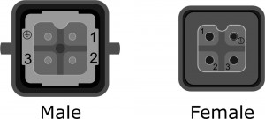
This project for ProSlide, a manufacture of sophisticated rides for water parks, required a detailed description of various components and how to maintain them.
Source material was a widely varying array of photos and drawings from various manufacturers. The goal was to keep the manual looking consistent, so I redrew the illustrations to maintain consistent style, quality and appropriate level of details, not all of which showed up prominently in photographs.
The following illustrations show connectors and pinouts, which are described in the text of the manual.
Sensible Illustrations for Software
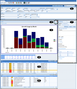
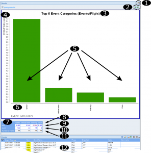
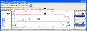
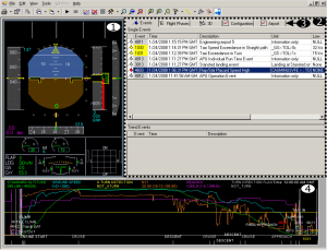
These illustrations for Teledyne Controls, an manufacturer of flight recording equipment and flight analysis software, show the sophisticated statistical graphs and flight replay displays available in the analysis package.
I find that many software manuals rely on screen shots with no labels indicating what the components of a control or display are called, and with a text that simply describes the names of fields with limited explanation of what they do, no more than you could describe yourself by simply looking at the software. This is presumably because the technical writers don’t understand the software, and add a lot of filler (screen shots) to make the manual look thick.
I have a very different philosophy. There is no need to show a screen shot for the sake of showing the user what they will encounter. However some screen shots can be useful when a detailed explanation is required. Such is the case here.
These complex statistical displays have many features and controls, including sophisticated filtering features. A textual description without a screen shot would make the manual difficult to understand, especially if read without the software at hand. There are so many features and zones on a typical screen, that it was necessary to label them with numbers and describe each by number in the text. Using numbers rather than labels de-clutters the illustrations and allows for easy reference within the text.
When Images Say More Than the Text
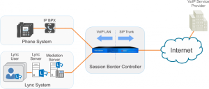
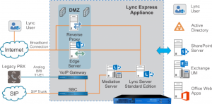
These illustrations for Sangoma Inc., a VoIP equipment manufacturer, are used to support very short technical marketing descriptions of their products. In these cases, the illustrations may say more than the accompanying text. They have the advantage of being informative to less technical readers, yet never the less answer limited technical details for more technically sophisticated readers.


